Use Case: Blood Pressure Report with Charts in C#
Providing human-readable reports in healthcare is an important part of improving transparency and patient satisfaction. This sample template shows how to visualize a series of blood pressure measurements in an easy-to-read report.

Healthcare reports from laboratories or healthcare systems can be complex, providing data in a form that only practitioners can understand. Providing human-readable reports in healthcare is an important part of improving transparency and patient satisfaction.
With Healthcare as one of our main industries, where TX Text Control is used in various areas, we have some insights into how professional reporting and document processing can be used to create beautiful, readable reports.
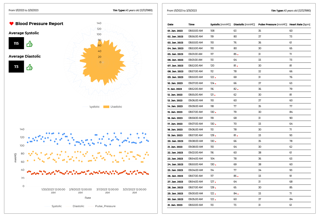
The template discussed in this article uses blood pressure measurement data to generate two charts and a data table. All elements are explained, including the data source used, the chart diagrams, merge fields, and merge blocks.
The following screenshot shows the first two pages of the resulting report exported to PDF.
XML Data Source
The data source for the merge process is an XML file, which in many cases is the data exchange format for medical devices or the export format of health apps such as Health for iOS.
<?xml version="1.0" encoding="UTF-8" ?>

<reports>
  <report>
    <patient_name>Tim Typer</patient_name>
    <patient_dob>12/12/1980</patient_dob>
    <patient_age>43</patient_age>
    <measurements_start>1/1/2023</measurements_start>
    <measurements_end>3/31/2023</measurements_end>
    <measurements_avg_sys>115</measurements_avg_sys>
    <measurements_avg_dia>73</measurements_avg_dia>
    <measurements_avg_pulse>33</measurements_avg_pulse>
    <measurements>
        <Date>1/1/2023</Date>
        <Time>08:50</Time>
        <Systolic>108</Systolic>
        <Diastolic>63</Diastolic>
        <Pulse_Pressure>35</Pulse_Pressure>
        <Heart_Rate>60</Heart_Rate>
    </measurements>
    <measurements>
        <Date>1/2/2023</Date>
        <Time>08:56</Time>
        <Systolic>119</Systolic>
        <Diastolic>80</Diastolic>
        <Pulse_Pressure>37</Pulse_Pressure>
        <Heart_Rate>73</Heart_Rate>
    </measurements>

    ...
Mail Merge Elements
The template consists of various mail merge elements including merge fields, merge blocks and charts. The header contains simple merge fields such as patient name and the date of birth:
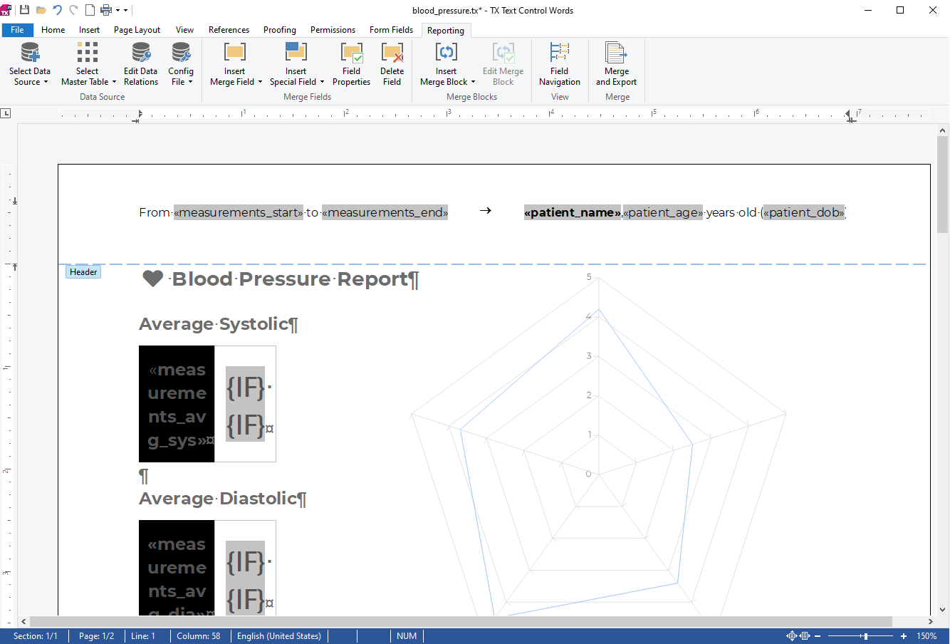
In the first section of the report, the average blood pressure data is visualized as a number and a thumbs-up or thumbs-down depending on the values. This is done using two IF fields, one in green color and one in red. The true text for the green IF field is the Unicode "thumbs-up" character if the condition is met that the average value is less than 120. The red field is the opposite.
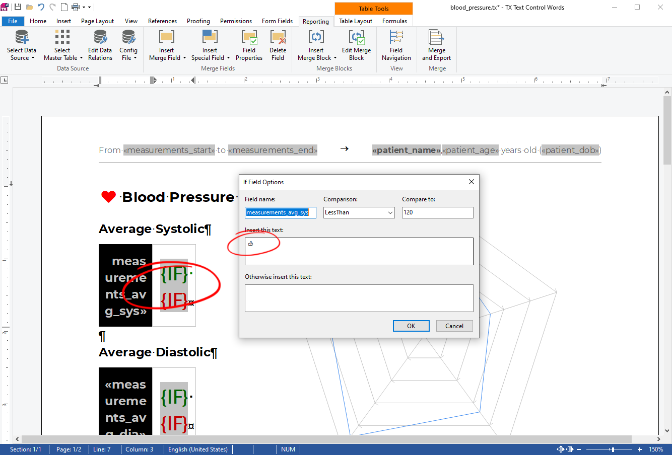
After the merge, when the positive conditions are met, the true text is rendered in green.

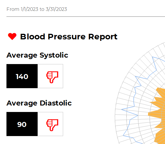
In a negative case, the second red field is rendered.
Data Charts
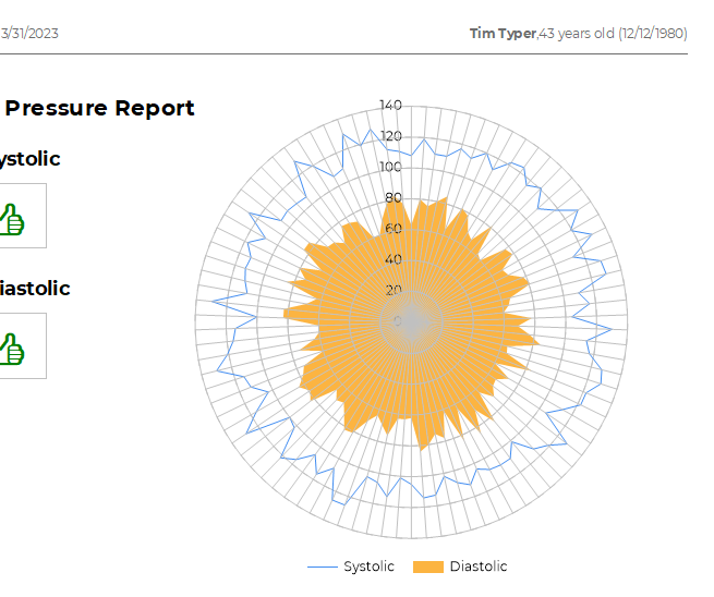
The first chart is of type radar that displays the systolic and diastolic data in the form of a two-dimensional chart to easily visualize spike areas.
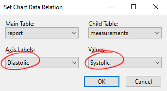
For this chart, the main table is report and the associated child table is measurements. The systolic and diastolic values are used for the 2 axes.
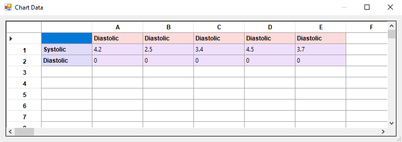
To add the second value, add a second Diastolic line to the Chart Data dialog box.
After a successful merge, both measurements are used and visualized.
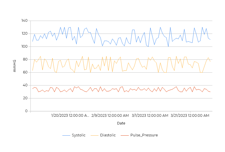
The second chart is a line chart with an additional value for the pulse pressure along with the systolic and diastolic values.
Data Table Merge Block
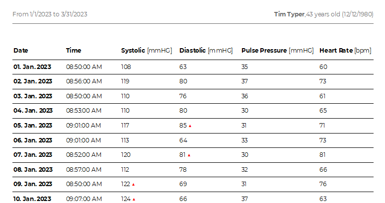
The data table is a repeating merge block that lists all measurement data in a clean table with a table header.
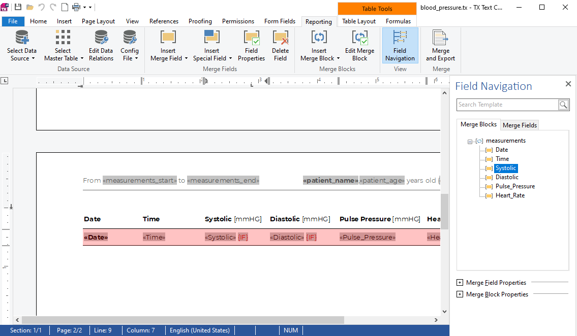
In the template, the merge block is a table row containing the measurement merge fields. The first row of the table is set to repeat on each page.
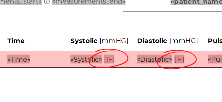
In the two columns listing the systolic and diastolic pressure values, an additional IF field is used to visualize a value that is higher than the normal, expected value. This field is created using the same technique as the thumbs up fields in the introductory section of the report. If the value is greater than 120, a red triangle is conditionally rendered.
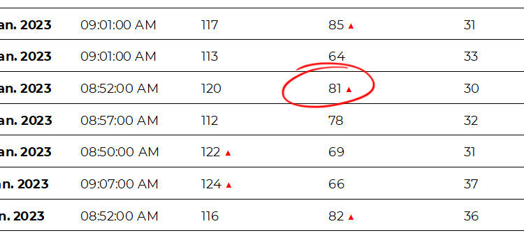
In the resulting document, the red triangles are rendered in the repeating merge block.
Download Template and Data
For your own testing, you can download the template and the sample XML data. Load the template into the provided TX Text Control Words sample application, load the XML file as the data source by clicking Load XML File from the Select Data Source button in the Reporting ribbon tab. Click on Merge and Export to view the results.
Template and data: blood_data.zip
ASP.NET
Integrate document processing into your applications to create documents such as PDFs and MS Word documents, including client-side document editing, viewing, and electronic signatures.
- Angular
- Blazor
- React
- JavaScript
- ASP.NET MVC, ASP.NET Core, and WebForms
Related Posts
When to Generate Documents Server-Side Instead of Client-Side: A Focus on…
When it comes to document generation, deciding whether to handle the task server-side or client-side is a key architectural decision for any organization. This article discusses the benefits of…
Designing the Perfect Contract Template for MailMerge in C#
This article shows how to create a contract template for MailMerge in C# using the TX Text Control .NET Server component. It uses JSON data to merge the template with the data including table of…
Getting Started Video Tutorial: How to use the MailMerge and…
This video tutorial shows how to use the MailMerge and ServerTextControl classes in an ASP.NET Core application using C#. This tutorial is part of the TX Text Control Getting Started series…
ASP.NETASP.NET CoreGetting Started Video
Getting Started Videos: New Text Control YouTube Channel
We just launched a new YouTube channel that is dedicated to getting started videos. The first videos show how to use the Document Editor, Document Viewer, and MailMerge components in ASP.NET Core…
ASP.NETMailMergeServerTextControl
Creating Valid XRechnung / ZUGFeRD Invoices with ASP.NET Core C#
This article shows how to create valid XRechnung and ZUGFeRD invoices with ASP.NET Core C#. The invoice is created with the help MailMerge component and the ZUGFeRD-csharp library.


