Control Settings
Customize borders, pagination, scrollbars, and appearance
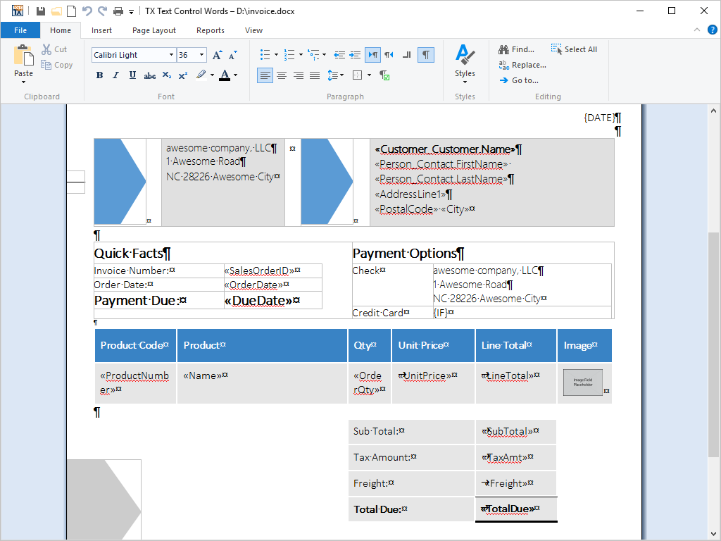
TX Text Control .NET for WPF provides several options to define the appearance and behavior of documents. These characteristics can be set using the rich selection of control settings.
Appearance Control Settings
Appearance control settings include view modes (normal and page), document background color, scrollbar positioning, and whether to display scrollbars and control characters.
Behavioral Control Settings
Behavioral control settings include edit mode, whether text is read-only, selectable, or editable, and tab behavior. For example, the tab key behavior can be toggled between inserting a tab character and moving the focus of the caret to the subsequent control in the predefined tab order.
Feature Availability
This feature is available in the following four TX Text Control .NET for WPF products:
| Product code | Product description | Unit price | |
|---|---|---|---|
| TX-3400-WE-S |
TX Text Control .NET for WPF Enterprise 34.0:
|
$3,398.00 | |
| TX-3400-WE-T-S |
TX Text Control .NET for WPF Enterprise 34.0:
|
$6,798.00 | |
| TX-3400-WP-S |
TX Text Control .NET for WPF Professional 34.0:
|
$1,649.00 | |
| TX-3400-WP-T-S |
TX Text Control .NET for WPF Professional 34.0:
|
$3,298.00 | |
| Technical and pricing information (excluding VAT where applicable) are subject to change without notice. | |||

