Customizing the Ribbon in TX Text Control for Angular
This post will guide you through the process of customizing the ribbon by changing its colors, adding new groups with custom buttons using Angular HttpClient to dynamically load HTML content, and removing existing buttons to create a more personalized user experience.

Introduction
A ribbon is a user interface control element that consists of a set of toolbars grouped into multiple tabs. The TX Text Control Document Editor allows for extensive ribbon customization, which can be adapted to suit the specific requirements of your Angular application.
The ribbon bar in TX Text Control is built entirely in pure HTML and CSS, making it exceptionally easy to customize. This post will guide you through the process of customizing the ribbon by changing its colors, adding new groups with custom buttons using Angular HttpClient to dynamically load HTML content, and removing existing buttons to create a more personalized user experience.
Getting Started with TX Text Control
To begin with, make sure TX Text Control is correctly set up in your Angular project. For a step-by-step installation and getting started guide, please refer to our earlier tutorials:
Ribbon Customization Guide
Changing the Ribbon's Color
Customizing the color of the ribbon can be easily achieved by modifying your project's CSS file, which is located in your Angular application under src/app/style.css.
Customizing Tab Color:
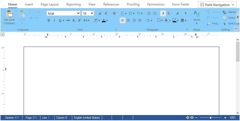
To change the color of the "Home Tab" to a gentle blue, insert the following snippet into your style.css:
#ribbonTabHome {
    background-color: lightskyblue;
}
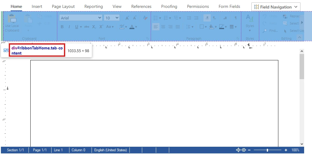
If you want to apply a custom color to other tabs or groups within the ribbon, you can easily do so by using the appropriate HTML ID for the tab or group you wish to customize.
Inspect the HTML structure using your browser's developer tools to identify the HTML ID.

Customizing Group Color:
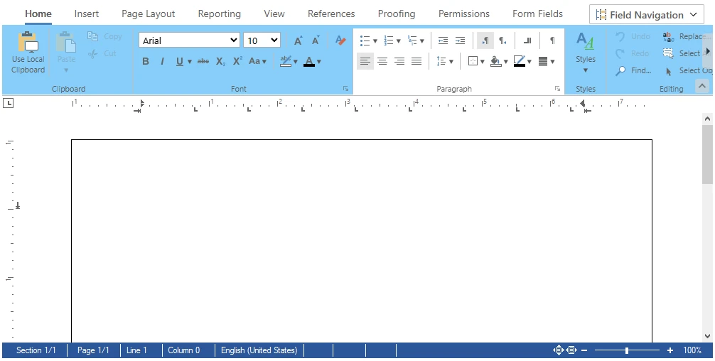
For example, to change the color of the "Paragraph Group", add the following to your style.css:
#ribbonGroupParagraph {
  background-color: white;
}
Dynamically Loading Ribbon Content
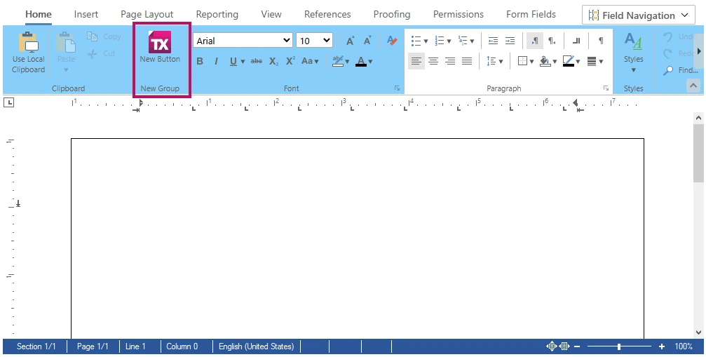
Adding new functionality to the ribbon is easy. This can be achieved by loading HTML content dynamically and injecting it into the existing ribbon structure.
This HTML snippet adds a new group to the ribbon with a custom button that features an icon. The button triggers a simple alert when clicked, showing interactive capabilities.
<div class="ribbon-group" id="ribbonGroupNewGroup" data-applicationmodes="0">
  <div class="ribbon-group-content">
    <div id="newTabButtonContainer" class="ribbon-button-container">
      <div onclick="alert('New button clicked!');" class="ribbon-button ribbon-button-big" id="btnNewButton" role="button">
        <div class="ribbon-button-big-image-container">
          <img src="/icon.png" alt="Icon" class="ribbon-button-big-image" style="height: 32px; width: 32px;">
        </div>
        <div class="ribbon-button-big-label-container">
          <p id="btnNewButton_caption" class="ribbon-button-label">
            <span class="ribbon-button-label-text">New Button</span>
          </p>
        </div>
      </div>
    </div>
  </div>
  <div class="ribbon-group-footer">
    <div class="ribbon-group-label-container">
      <p class="ribbon-group-label">New Group</p>
    </div>
  </div>
</div>
The below code snippet which should be placed in src/app/app.component.ts, demonstrates how HttpClient fetches the HTML content that features a new group with a custom button, triggered by the ribbon
import { Component, HostListener, OnInit} from '@angular/core';
import { HttpClient } from '@angular/common/http';
import { CommonModule } from '@angular/common';
import { RouterOutlet } from '@angular/router';
import { DocumentEditorModule } from '@txtextcontrol/tx-ng-document-editor';

declare const TXTextControl: any;

@Component({
  selector: 'app-root',
  standalone: true,
  imports: [CommonModule, RouterOutlet, DocumentEditorModule],
  templateUrl: './app.component.html',
  styleUrl: './app.component.css'
})

export class AppComponent implements OnInit {
  title = 'my-editor-app';
  newGroupHtml: string = '';

  constructor(private http: HttpClient) {}

  ngOnInit() {
    //Load new group HTML on component initialization.
    this.loadNewGroupHtml().subscribe(html => {
      this.newGroupHtml = html;
    });
  }

  //Add ribbon modifications when TX Document Editor is loaded.

  @HostListener('document:txDocumentEditorLoaded')
  onTxDocumentEditorLoaded() {
    TXTextControl.addEventListener("ribbonTabsLoaded", () => {
      this.addNewGroup();
    });
  }

  //Retrieve new group HTML from the server.

  loadNewGroupHtml() {
    return this.http.get('/new-group.html', { responseType: 'text' });
  }

  //Dynamically insert a new button group into the ribbon.

  addNewGroup() {
    const newButtonGroup = document.getElementById('ribbonGroupFont');
    if (newButtonGroup && this.newGroupHtml) {
      newButtonGroup.insertAdjacentHTML('beforebegin', this.newGroupHtml);
    } else {
      alert('Symbols group container not found or HTML not loaded.');
    }
  }
Ensure you have the new-group.html and any necessary icons hosted on your server.
Removing a Button from the Ribbon
Removing rarely used features simplifies the interface, highlighting essential tools for users.
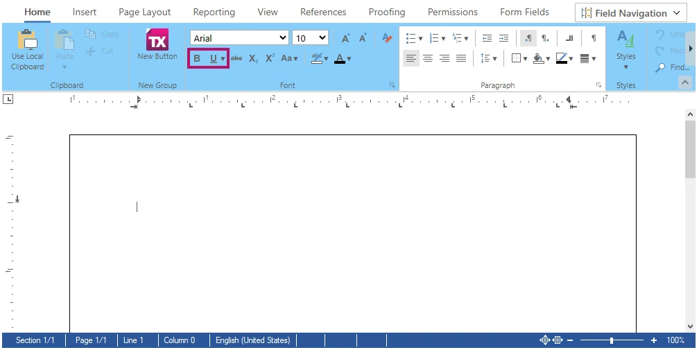
For example, the below code shows how to remove the "Italic Button" from the "Font Group". This function removeItalics checks for the button's presence and removes it.
removeItalics() {
    const ribbonTabHome_btnItalic = document.getElementById("ribbonTabHome_btnItalic");
    if (ribbonTabHome_btnItalic) {
      ribbonTabHome_btnItalic.remove();
    } else {
      alert('Italic button in the "Font" group not found.');
    }
  }
Make sure to include the function removeItalics in the event listener.
@HostListener('document:txDocumentEditorLoaded')
  onTxDocumentEditorLoaded() {
    TXTextControl.addEventListener("ribbonTabsLoaded", () => {
      this.addNewGroup();
      this.removeItalics();
    });
  }
Conclusion
Customizing the ribbon in TX Text Control for Angular, whether by changing colors, adding features, or removing buttons, improves both the look and functionality of your application.
Angular
Integrate document processing, editing, sharing, collaboration, creation, electronic signatures, and PDF generation into your Angular Web applications.
Related Posts
Reuse Persistent Document Editor Components in Angular SPA Applications
An Angular Single Page Application (SPA) dynamically updates the web page without reloading by loading all necessary resources once. This article demonstrates how to reuse persistent Document…
Building an ASP.NET Core Backend (Linux and Windows) for the Document Editor…
This article shows how to create a backend for the Document Editor and Viewer using ASP.NET Core. The backend can be hosted on Windows and Linux and can be used in Blazor, Angular, JavaScript, and…
AngularJavaScriptDocument Editor
Getting Started: Document Editor Version 33.0 with Angular CLI 19.0
This article shows how to use the TX Text Control Document Editor version 33.0 npm package for Angular within an Angular CLI 19.0 application. It uses the trial backend running on our servers, but…
AngularASP.NET CoreDocument Editor
Changing the Language in the Angular Document Editor Using the Resource Kit
This article walks you through the process of building a satellite assembly using the Resource Kit to customize the language of the TX Text Control interface in the Angular Document Editor.
AngularASP.NET CoreDocument Editor
Getting Started Video Tutorial: How to use the Document Editor in Angular
This video tutorial shows how to use the Document Editor in an Angular application. This tutorial is part of the TX Text Control Getting Started series originally published on our YouTube channel.

