Best Practices for Adding Ribbon Tabs, Groups and Buttons to the TXTextControl.Web Ribbon Bar
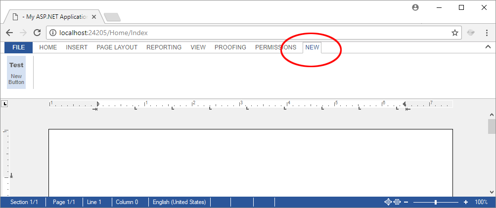
The Web.TextControl ribbon bar uses pure HTML and CSS, so developers can extend it without modifying control source code. Custom tabs, groups, and buttons are loaded as HTML fragments via jQuery in the ribbonTabsLoaded event and inserted into the existing ribbon DOM structure.

TX Text Control .NET for ASP.NET is shipped with a fully-featured Ribbon control and ready-to-use Ribbon tabs for all typical tasks of TX Text Control. That allows a rapid application building within seconds without writing a single line of code.
The ribbon bar is completely built in pure HTML and CSS and can be therefore easily manipulated. Elements can be added, removed and rearranged.
This article explains the easiest way of adding new content to the existing ribbon bar by loading pre-designed HTML using jQuery into the ribbon DOM.
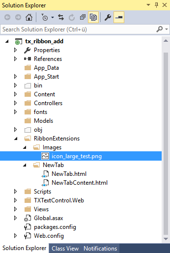
First of all, create a new folder in your project that contains the HTML and resources for your custom ribbon content. In this sample, the folder is named RibbonExtensions:

For each new ribbon tab, a new folder has been created. This whole folder and file structure is just a sample and can be structured based on your actual requirements and preferences.
The HTML of a new ribbon tab container looks like this:
<li>
    <a id="tabNew"
       tabindex="-1"
       rel="ribbonTabNew"
       data-applicationmodes="0"
       class=""
       data-text="New">
        New
    </a>
</li>
The HTML representation of new ribbon tab content is shown in the following GitHub gist:
<div class="tab-content" id="ribbonTabNew" style="display: none;">
    <!-- Clipboard group -->
    <div class="ribbon-group" id="ribbonGroupClipboard">
        <div class="ribbon-group-content">

            <div id="newTabButtonContainer"
                 style="display: inline-block; float: left; margin-right: 5px">

                <div onclick="alert('Clicked! JavaScript is part of loaded Html in this case.');"
                     class="ribbon-button ribbon-button-big"
                     id="btnNewButton">

                    <div class="ribbon-button-big-image-container">
                        <img src="/RibbonExtensions/Images/icon_large_test.png"
                             class="ribbon-button-big-image">
                    </div>
                    <div class="ribbon-button-big-label-container">
                        <p class="ribbon-button-label">New<br>Button</p>
                    </div>
                </div>

            </div>

        </div>
    </div>
</div>
The following JavaScript code is loading the HTML dynamically after the ribbon has been loaded completely. In the ribbonTabsLoaded event of TX Text Control, jQuery is used to get the HTML in order to add it after the last existing tab.
After that, the tab content is loaded and dynamically added to the last content container item.
// ribbon can be manipulated when complete ribbon has been loaded
TXTextControl.addEventListener("ribbonTabsLoaded", function (e) {

    // get the new tab container and add it after the existing last tab
    $.get("/RibbonExtensions/NewTab/NewTab.html", function (data) {

        $("ul.tabs:first li:last").after(data);

        // attach the click event to switch tabs on a click
        $("#tabNew").click(function () {
            switchTabs($(this));
        });

    });

    // get the ribbon tab content and add it to the content container
    $.get("/RibbonExtensions/NewTab/NewTabContent.html", function (data) {

        $("#txRibbonTabContentContainer div:last").after(data);

    });

});

// enables the clicked tab and disables other tabs
function switchTabs(tabObject) {
    $('#txRibbonTabContentContainer div.tab-content').css("display", "none");
    $('#ribbonbar ul.tabs a').removeClass("selected");
    var id = tabObject.attr("rel");

    $('#' + id).css("display", "inline-block");
    tabObject.addClass("selected");
}
Additionally, a click event is attached to the ribbon tab menu item to switch the tabs programmatically when a user clicks on the menu item title. The function switchTabs hides the current content in order to display our new content.

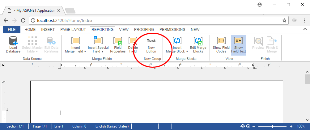
In the next step, a new ribbon group with a button should be added to the Reporting ribbon tab after the Merge Fields group. The following HTML is the group representation including the custom button:
<div class="ribbon-group" id="ribbonGroupNewGroup" data-applicationmodes="0">
    <div class="ribbon-group-content">

        <div id="newTabButtonContainer"
             style="display: inline-block; float: left; margin-right: 5px">

            <div onclick="alert('Clicked! JavaScript is part of loaded Html in this case.');"
                 class="ribbon-button ribbon-button-big"
                 id="btnNewButton">

                <div class="ribbon-button-big-image-container">
                    <img src="/RibbonExtensions/Images/icon_large_test.png"
                         class="ribbon-button-big-image">
                </div>
                <div class="ribbon-button-big-label-container">
                    <p class="ribbon-button-label">New<br>Button</p>
                </div>
            </div>

        </div>

    </div>
    <!-- Ribbon group label -->
    <div class="ribbon-group-label-container">
        <p class="ribbon-group-label">New Group</p>
    </div>
</div>
In the ribbonTabsLoaded event, this HTML gets loaded and added after the existing ribbon group:
TXTextControl.addEventListener("ribbonTabsLoaded", function (e) {

    // get the ribbon tab content and add it after the Merge Fields group in
    // the reporting tab
    $.get("/RibbonExtensions/ReportingTab/NewGroup.html", function (data) {

        $("#ribbonGroupMergeField").after(data);

    });

});
Test this on your own by downloading this sample project from our GitHub repository.
Also See
This post references the following in the documentation:
- Javascript: TXText
Control.add Event Listener Method
![]()
Download and Fork This Sample on GitHub
We proudly host our sample code on github.com/TextControl.
Please fork and contribute.
Requirements for this sample
- Visual Studio 2015 or better
- TX Text Control .NET Server (trial sufficient)
ASP.NET
Integrate document processing into your applications to create documents such as PDFs and MS Word documents, including client-side document editing, viewing, and electronic signatures.
- Angular
- Blazor
- React
- JavaScript
- ASP.NET MVC, ASP.NET Core, and WebForms
Related Posts
ASP.NETJavaScriptDocument Editor
Detect Toggle Button Changes Using a MutationObserver
This article shows how to detect changes of toggle buttons in the ribbon of the web editor using a MutationObserver. The state of a toggle button in the ribbon visualizes the state of a certain…
Build a Custom Backstage View in ASP.NET Core with TX Text Control
This article shows how to build a custom backstage view with a File tab to load your multi-format documents using TX Text Control for ASP.NET Core applications.
5 Document Workflows You Can Automate With JavaScript Rich Text Editor
Enterprise JavaScript rich text editors outperform open source and basic alternatives for document automation. This guide covers five document workflows with TX Text Control: contract generation…
Add JavaScript to PDFs with TX Text Control in C# .NET: Time-Based Alerts…
In this article, we explore how to enrich PDF documents with JavaScript using TX Text Control in C# .NET. Read on to learn how to create time-based alerts that trigger actions based on specific…
Using the Document Editor in SPA Applications using the removeFromDom Method
This article shows how to use the removeFromDom method to remove the Document Editor from the DOM when it is no longer needed. This is useful when the Document Editor is used in a Single Page…


